
Prerequisites
Please answer the following questions before submitting an issue.
- What is your product version: ABP 10.2
- What is your product type (Angular or MVC): Angular
- What is product framework type (.net framework or .net core): .net framework
If issue related with ABP Framework
- What is ABP Framework version: 10.2
If issue is about UI
- Which theme are you using: Default theme
- What are the theme settings: Metronic default theme for CSS ABP 10.2
Before upgrading to ABP 10.2 (from 9.0), the radio buttons and checkboxes looked like this:


After the ABP 10.2 upgrade, the radio buttons and checkboxes have flipped over so they look like this:


Additionally, as seen in the image above, our radio buttons and checkboxes are aligned vertically, as opposed to horizontally, like in the previous photos.
The font size and style has also changed since upgrading to ABP 10.2:

For reference, this is what it looked like before the upgrade:
I just wished to inquire whether this was a deliberate decision, or if this is a bug.
4 Answer(s)
-
0
Hi @hazel.gutierrez
With AspNet Zero 10.x (And Metronic 7.x), the sytanx for checkbox and radiobuttons changed. It should be like this;
 <label for="text">
    <input  type="checkbox" name="IsEnabled">
    <span></span>
    Text
</label>
You need to move text after the span element I think.
-
0
Thank you for the reply! I was wondering though - were these changes a deliberate decision on Metronic's part? Or is this a bug?
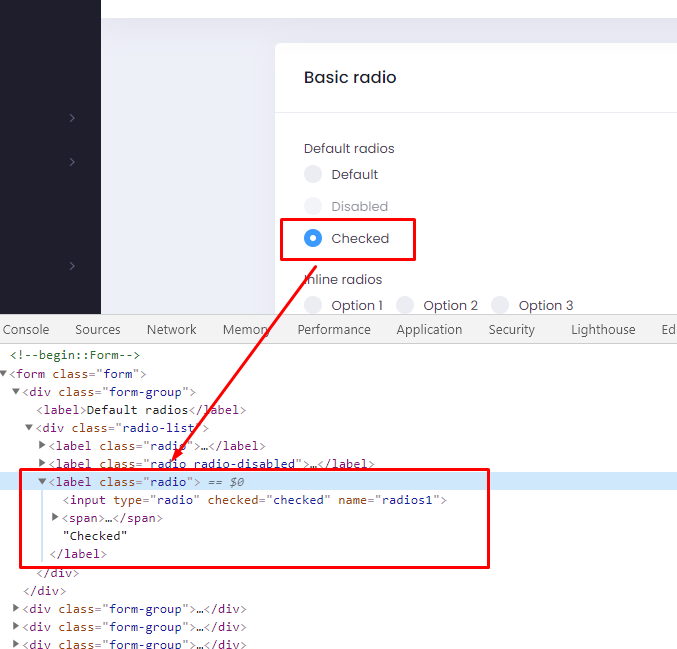
I just thought I'd ask because the current way Metronic has styled the checkboxes and radio buttons (that is, text then radio button) is a little less unintuitive than how it was previously. Furthermore, when I went on Metronic's website to look at the 7.x changes, the alignment of the buttons are still radio button, then text:

Here's the link where I found Metronic's notes on their 7.0 radio buttons: https://preview.keenthemes.com/metronic/demo1/crud/forms/controls/radio.html
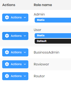
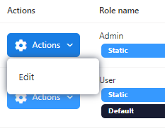
I noticed too that the font style and size is not consistent anymore. For example, when using the dropdown menus, I noticed that the font style and size don't match anymore:

Furthermore, the font style of the dropdown menus isn't consistent, as, after the upgrade to 10.2, when comparing the screenshot above and the one below, some of the dropdown menus have a different font style and size as each other:
-
0
Hi,
This was a change made by Metronic. Because of that, we had to change it on AspNet Zero. You can cehck the HTML in Metronic's demo;
-
0
Thank you! This is what we needed clarification on, thanks!
